
EVA Is an app designed to guide and help people throughout their traveling adventures. It is designed to provide the safest routes when traveling and visiting a foreign country for the first time. Users can rate adventures, highlight areas to avoid, and recommend 100% reliable local businesses. The app is powered by users and embraces traveling community collaboration.
The Project's Goal:
Design and develop an MVP (minimum viable product) for stakeholders.
Why do we need EVA?
Project overview
Let's be honest, travellers don't know cities as well as the locals. They can easily find themselves in dangerous situations because they've taken the wrong route or taxi driver, depending on the country, of course. I decided to create an app to make travellers feel safe and protected by their own community by avoiding getting lost and being taken advantage of by locals.
Why does it matter?
Why is this problem worth solving?
There have been extreme cases where people traveling solo have gotten lost and walked into a dangerous neighbourhood. Others have gotten robbed and found themselves in the middle of nowhere without essential belongings.
What value is presented to the user?
The app will present the safest places to visit, red zones to avoid, and the best transportation to take. Wearable will be provided to guide them without taking out their phone in public.
What value is presented to the business?
The app will be free to download. Users will have the liberty to subscribe to customizable plans to tailor services for their solo traveling ultimate experience. Additionally, there will be smartwatch application features or a seamless wearable. Eva will also profit from affiliation programs, data collection, and targeted advertisement.
Project's Goals:
- Conduct primary & secondary research
- Organise and deduce business and design opportunity areas
- Develop wireframes.
- Develop prototype based on usability and accessibility
- Iterate and develop hi-fi wireframes
- Deliver prototype and hi-fi wireframes
What I did
I used the double diamond strategy to help me explore and understand the user's problems, experiences, behaviour, and frustrations while traveling. I brainstormed business and design ideas to create solutions and sustainable products by gathering insightful data.
Project Duration - Timeline
80 hours

D I S C O V E R
The Process
I develop a SWOT analysis and created a business canvas model to visualise, understand and efficiently communicate the app's purpose and how it will make a profit.
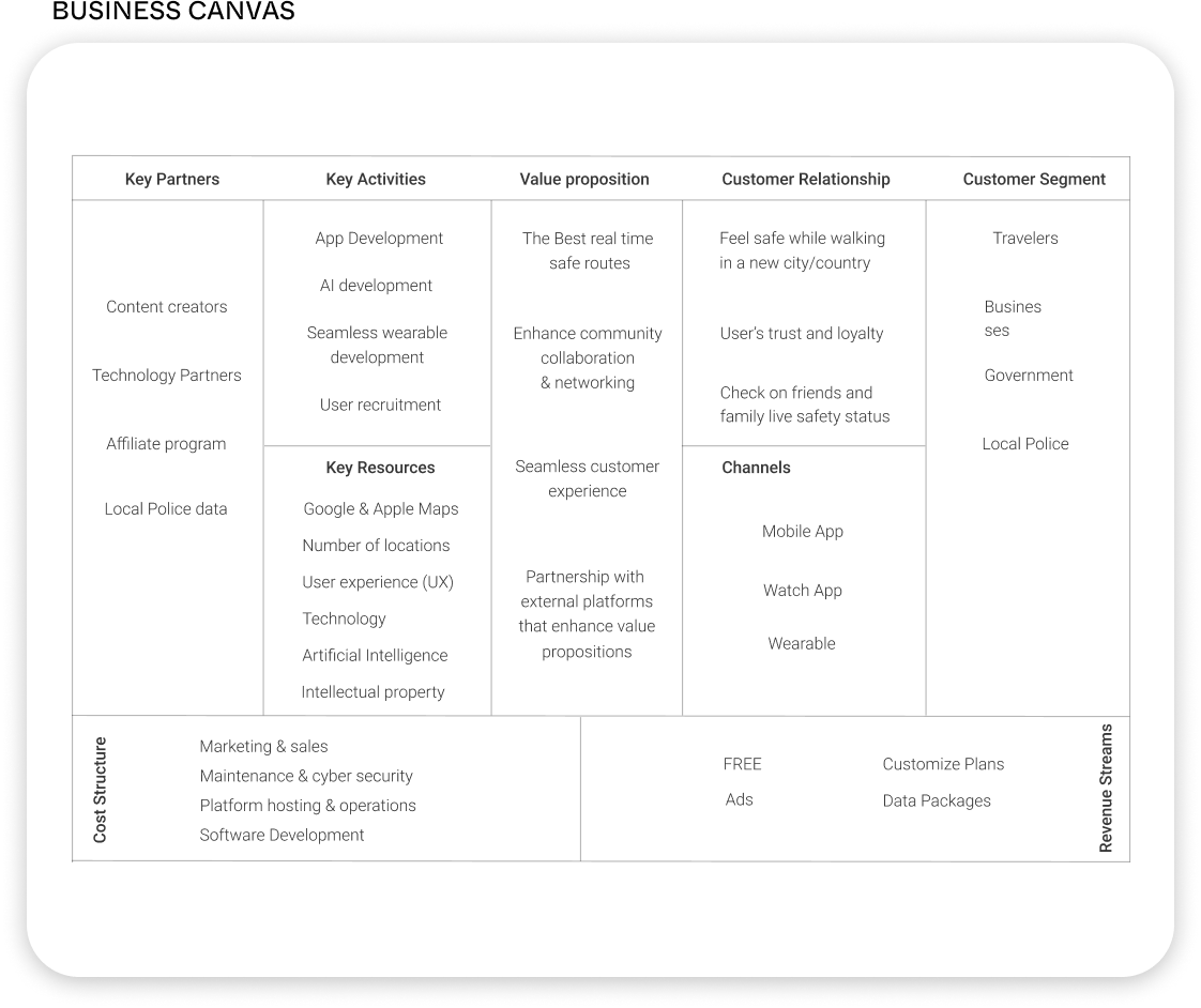
I then created a Value Proposition to ensure that Eva's services and app design would be able to satisfy its users' needs. Next, I created a competitive analysis where I was able to compare and identify unique features and services competitors offer to their users. Based on my interviews, I identified the top three "must-have" apps people prefer to use while traveling the world.

After understanding and developing the business foundation, I decided to conduct a survey to help me find the right audience and participants for the one-on-one interviews. This time, I performed the interviews face to face with people who have traveled alone, with a partner, or with family & friends.
The Problem
User's pain points while traveling
Safety concerns:
100% of participants have felt unsafe at one point in their travels.
"There is always that "you never know" in the back of your head when you walk alone."
Public transportation ratings:
Travellers have been found themselves in train or bus stations they wished they could've avoided.
"There are no reviews about train stations or routes."
Map Settings:
Participants wished to have an app to show them the safest routes
"Google map just shows you the fastest or shortest routes. Not the safest."

D E F I N E
Ideation
coming up with solutions
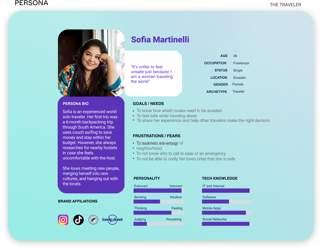
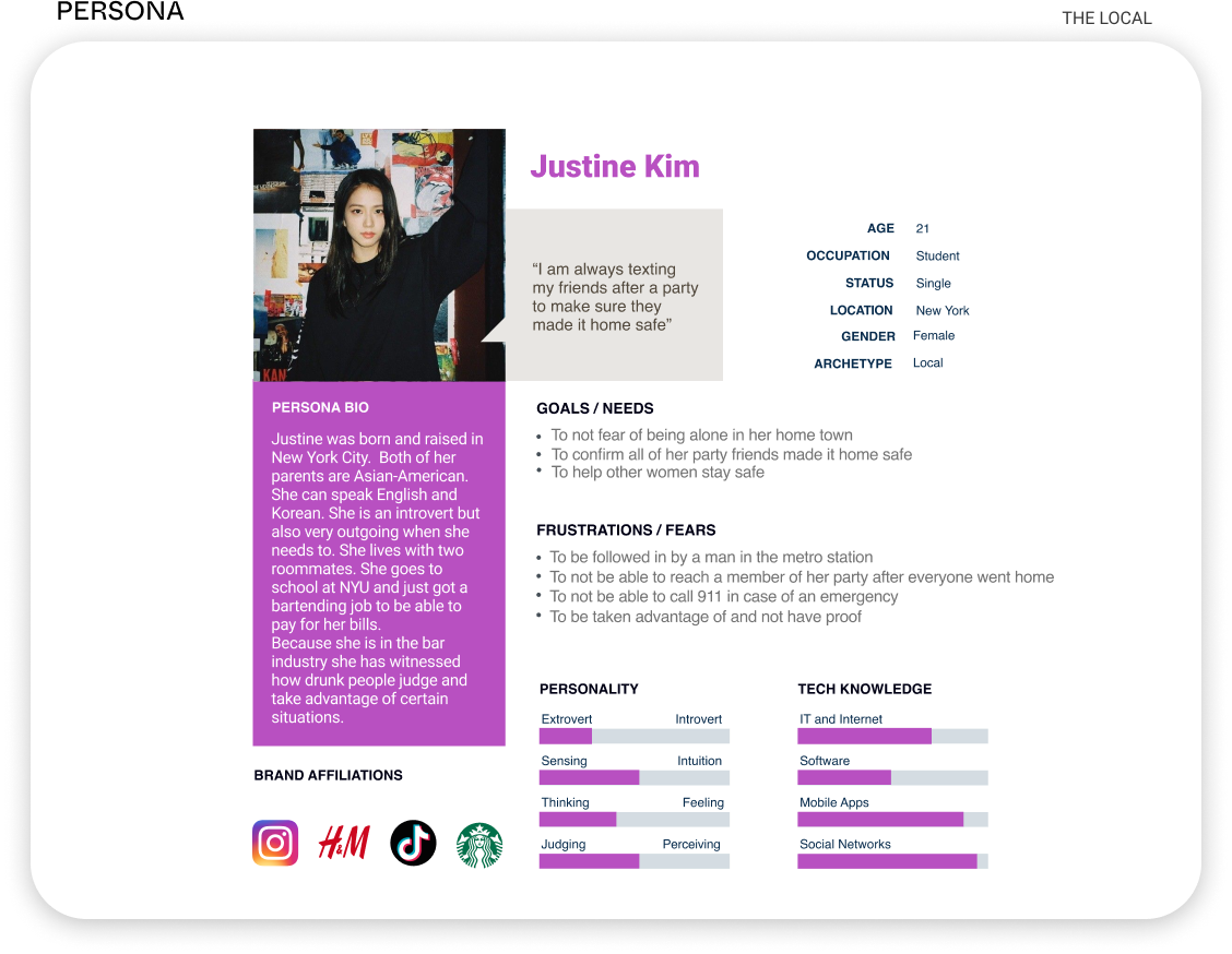
I wanted to place myself in the travellers' shoes and truly empathise with them and their negative experiences. Keeping in mind that this app would be powered by the community, I needed to understand two types of users. The local users who could keep the safest routes updated and suggest great places to eat, and the traveler user could profit and feel safer while exploring a new city.
After that, I started developing a roadmap to organize features I considered a "must-have" for the MVP model. Then I created an experienced model to explain and show the different experiences the app would provide its users throughout their journey.

And finally, I created an application site map and user flow to arrange how each feature would operate and how accessible it would be to deliver memorable experiences. I modified some user paths thanks to the card sorting exercise results.

Click here to discover more design tools and learn more about my research!

D E V E L O P
Prototype


High Fidelity Wireframes
My primary focus was to design and develop only the most important screens for the MVP product. These screens were used for user testings and later on iterated.


User Testings
Analysis the results
I wanted to make sure I could collect as much data as possible. This is why I decided to create two different types of user testings. One was created in Maze, where I was able to see where participants were clicking, abandoning the task, and how much time they were spending on each screen.

Then I did a one-on-one interview where I was able to talk and listen to participants while they explored the app. I grouped all the data and placed it in an affinity map.


D E L I V E R
Final product
Thanks to the valuable feedback and data, I developed an intuitive product focused on customers' safety and assistance through their traveling adventures.
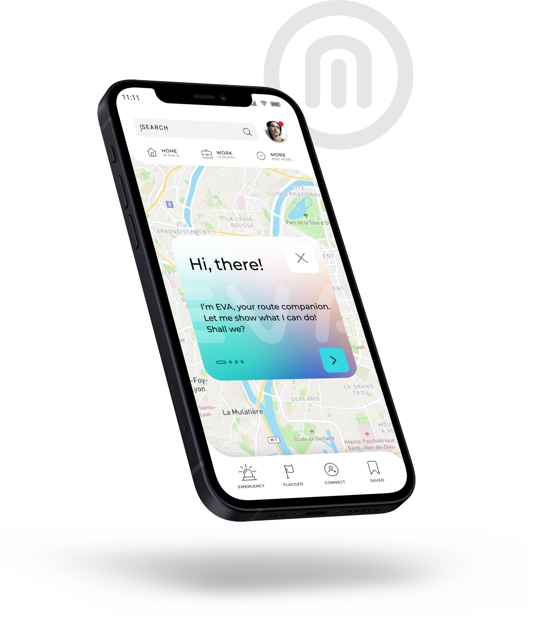
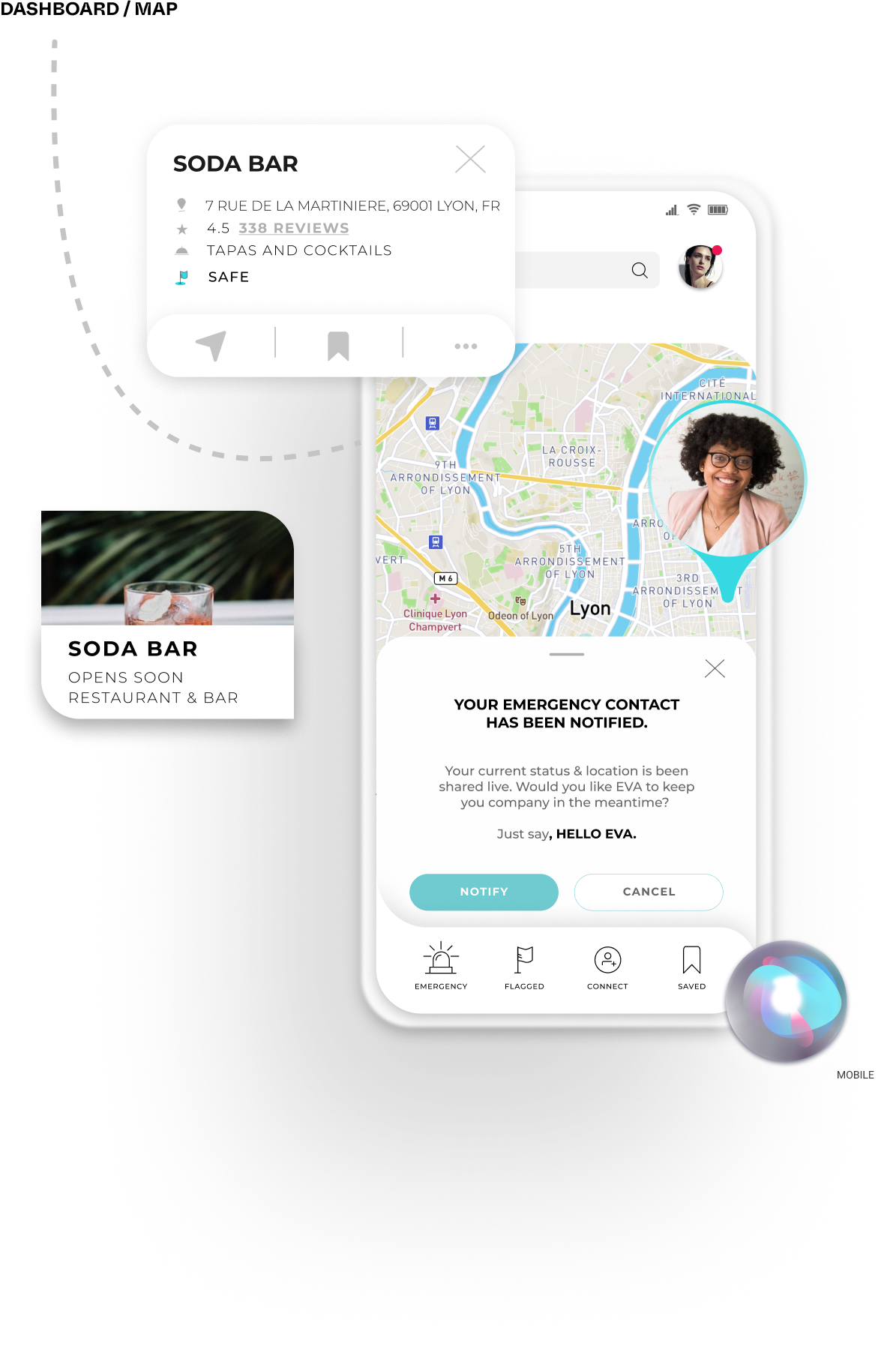
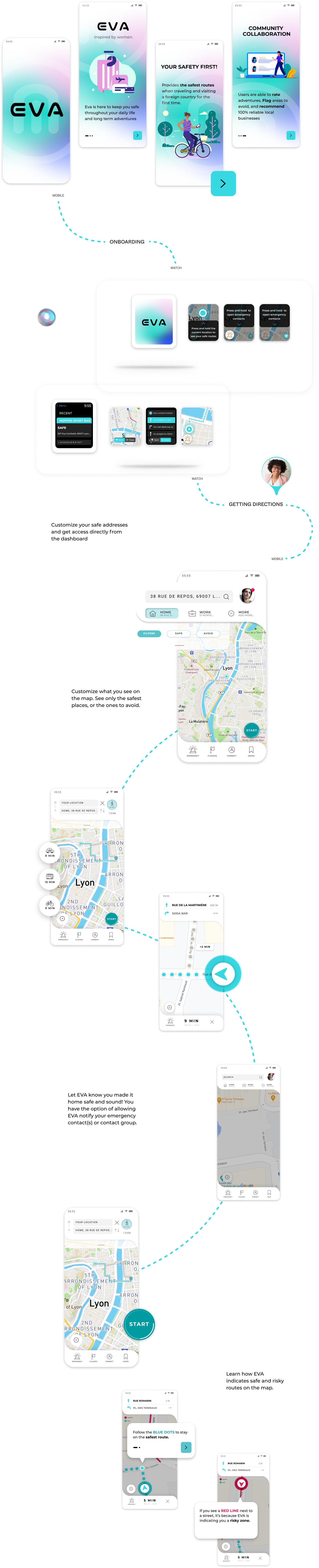
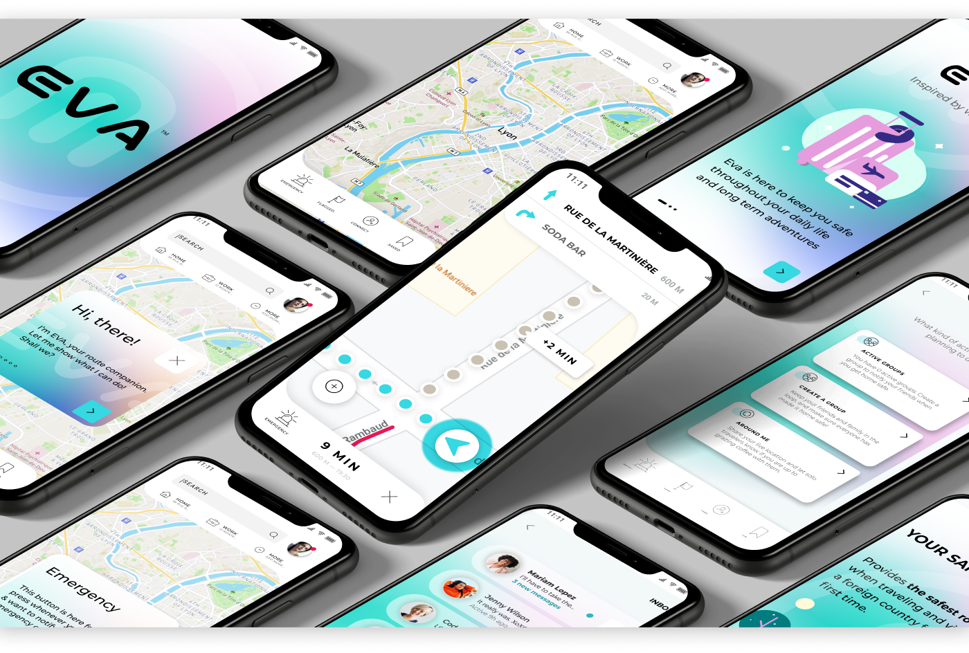
How would it work?
Eva will present four (always visible) significant buttons. The buttons will allow the user to access four different paths.
Emergency button:
The emergency button is designed to quickly send a notification to the user's emergency contact or the local police. Once the emergency notification has been sent, Eva will activate the microphone to record any background noise that can be used as evidence in an extreme situation. Users can also choose to start a pretend "call, " either voice or video. A dialog will be provided to users to follow along and make the conversation flow accurately.
Flagged:
The Flagged button will display areas that have been flagged, such as restaurants, bars, activities, routes, and more. Users will only display the type of flag they desire to see on the map. The Flagged areas are divided into three colors. Green, yellow, and red. Red would be the areas to avoid, and green the safest to go. Users would be able to check the latest updates and select the place they want to go.
Connect:
Users will use the connect button to find and meet locals and travellers like them. They will be able to share their location, to appear on the map. They can check people's activity located around them. And finally, they could connect with other travellers by scanning their personalized QRcode and vice-versa.
Saved:
The saved button works as the user's personalized folder. It will provide a list of all of the places they saved, have been, and would like to go to.


D E L I V E R
Prototype
Final Thoughts
What I learned
This project taught me the importance of staying objective. Thanks to all of the key findings I collected, I delivered solutions through features I believe could make people feel safe while traveling. There is one feature in particular that I am the proudest of, the emergency button. Having the option of "faking" a video or phone call while feeling unsafe could drive away dangerous people. Only because they might think it would be easier to get caught. Also, the fact that the phone will automatically record your surrounding after pressing the emergency button (if you allow it, of course) could really help local police with an investigation.
Even though I only had 80 hours to develop this project, I was able to work fast and create a sexy UI. I would love to keep working on this project. I spotted elements and interactions that could improve to create a better and sleeker experience and more intuitive usability.
What's Next?
Future Testing and Iterations
The next step for EVA would be to continue the development of crucial screens and iterate the ones that created pain points for the user during user testings. Eventually, re-test the same tasks and obtain more valuable feedback. We must consider that even though EVA was inspired by real women's problems while traveling alone, the app was made to help men and women equally.