
Kepler is a fictional aerospatial company I created to develop a PWA (Progressive Web App) website. Through this website, people would purchase tickets to go to space. I wanted to challenge myself to create a complete experience from purchasing the space tickets to scheduling their training, experiencing the spaceport lounge, orbiting the earth, and landing safely.
To tell you a bit about the spatial company, Kepler would be a new space tourism company that aims to provide space flights for space daydreamers in the near future. Their number one competitor, Virgin Galactic, is widely regarded as the front runner within the 'space tourism race, having put one of its space planes in outer space in 2018. Virgin Galactic has already sold hundreds of tickets for future flights into space. Kepler hopes to start selling its tickets and space travel packages by the end of 2021.
Why create a PWA for Kepler?
Project overview
In July 2020, Virgin Galactic successfully launched their first orbital space flight. I started to think about the future and how different this experience should be for those paying to go to space. I then decided to create a case study that would cover the entire spatial service.
So, I decided to come up with the following scenario:
KEPLER's new aerospatial tourism company wants to be the #1 provider for suborbital space flights. Their tickets will be soon available for purchase, but their current website is not 100% responsive. They would like their new site to be accessible on every device. Research has shown that customers are more likely to make purchases while using their mobile devices. The new site needs to be 100% responsive and behave like an intuitive, user-friendly app.
What I did
I used the double diamond strategy to develop the case study. I covered UX research, user experience design, service design, and UI design.

The Process
Finding the problem
To understand user expectations when it comes to space traveling flight booking experience. I Compared users' navigation on today's traveling websites and how travelers currently go through the booking process. Keep in mind that this project's goal was to develop a responsive web design and a clearly defined user task flow for the MVP that would include searching, booking, and checking in for commercial space flights.
Some of the research questions I intended to answer through surveys, and one-on-one interviews were the following:
- What are the most popular traveling booking sites?
- Why do people like those sites?
- Why do they stay loyal and trust those sites?
- Where do they prefer to use the service? In which device?
- How can Kepler attract people to want to travel with them?
I was able to recruit four participants between 20 and 40 years old. They dreamt of experiencing space traveling and are willing to pay a highly-priced ticket.
Project Duration - Timeline
80 hours

D I S C O V E R
Primary and secondary research
During the discovering part of the case study, I did secondary research about the travel industry. I cover different types of travel services. They varied from exotic to high adrenaline type of experiences. After learning about their offerings, client expectations, and pricing, I developed a SWOT analysis, value proposition, and competitor's analysis for Kepler.

I then started the primary research, where I conducted interviews, collected the insights, and used different design thinking methods to
reveal business opportunities, identify challenges and develop services. After understanding the User's needs, experience expectations, and desires, I created a persona. My persona combined insights found in the empathy map and value proposition. Creating a persona really helped me understand and identify users' behaviours, expectations, and goals.

The Problem
What are some of the user's concerns and pain points?
Mobile booking experience:
Almost 90% of participants prefer to plan and book their vacation using a computer.
"When booking a flight on the phone, it's hard and annoying to go back and forward between tabs."
Booking confirmation:
Participants had a negative experience after purchasing several tickets at once and not getting a receipt or flight information.
"Waited over an hour for an email confirmation and the information of the flight."
Budget:
100% of participants agreed that flying to space would be incredibly expensive and discouraged dreaming about going to space.
"It's so expensive, I don't know If I will ever be able to afford it."
D E F I N E
Ideation
coming up with solutions
After organising and collecting great insights, I started brainstorming solutions and opportunities for Kepler. I developed a roadmap to help me prioritise features, services, and experiences.

Kepler's Roadmap
I then created a three-circle analysis to have a different perspective and visualisation of Kepler's possible services and products. Then I decided to do a card sorting exercise to understand the user navigation pattern. Which allowed me to create a site map based on the user's expectations. I created intuitive information paths for customers to quickly find what they are looking for. Which lead me to the development of an experience map.

Want to know learn more about my research? Click here to take a closer look
D E V E L O P
Prototype


Hi-Fidelity Wireframes

User Testings
After creating a set of wireframes, I went ahead and created mid-fidelity wireframes to use for the user testings. I contacted previous participants and performed user testing in which I asked them to do two different tasks. I encouraged them to speak their mind and share their thoughts as they performed the tasks.

The results
After performing user testings, I noticed that participants were misclicks while performing the tasks. Some of them started to get frustrated and impatient. To confirm some insight and suggestions I obtained from participants during the user testing interview, I decided to use MAZE to collect information on where people were misclicking and which screen they were spending more extended time on.
Then, I created an affinity map to display important insights and the overall experience users had while navigating Kepler's PWA site.

D E L I V E R
Final product
It is crucial to consider that several people are not interested in space travel because they fear the unknown. It would be interesting to conduct a research study to focus on how Kepler could create and deliver a service that would make new users feel safe and excited while confronting one of their biggest fears.

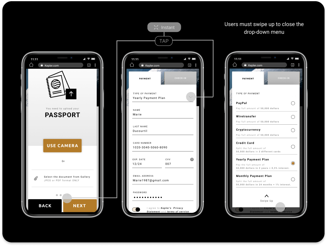
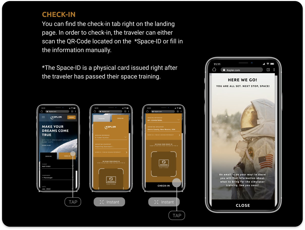
PWA - Mobile interactions
Booking your flight


D E L I V E R
Prototype
Final Thought
What I learned
I started this PWA design to conduct it as a sprint. I wanted to work fast and use the 80 hours I was given wisely and efficiently. Because I have become more agile with Figma, I created high-fidelity wireframes within two days. I got inspired by Nasa's and Travelocity's websites. I like how clean and easy it is to navigate Travelocity, so I really paid attention to their information architecture layout.
This was the first project where I had to create a fictional business and its demands. Because space travel is unfamiliar, comparing features and services from direct space travel competitors was challenging.
What's Next?
Future Testing and Iterations
Because my background is in interior architecture, I would like to come back and create a 3D modeling of the spaceport lounge. I would like to iterate and perform additional user testing interviews with a broader range of participants with different backgrounds and social classes. Create customer loyalty and motivation strategy to help Kepler have a 100% ticket purchase completion