
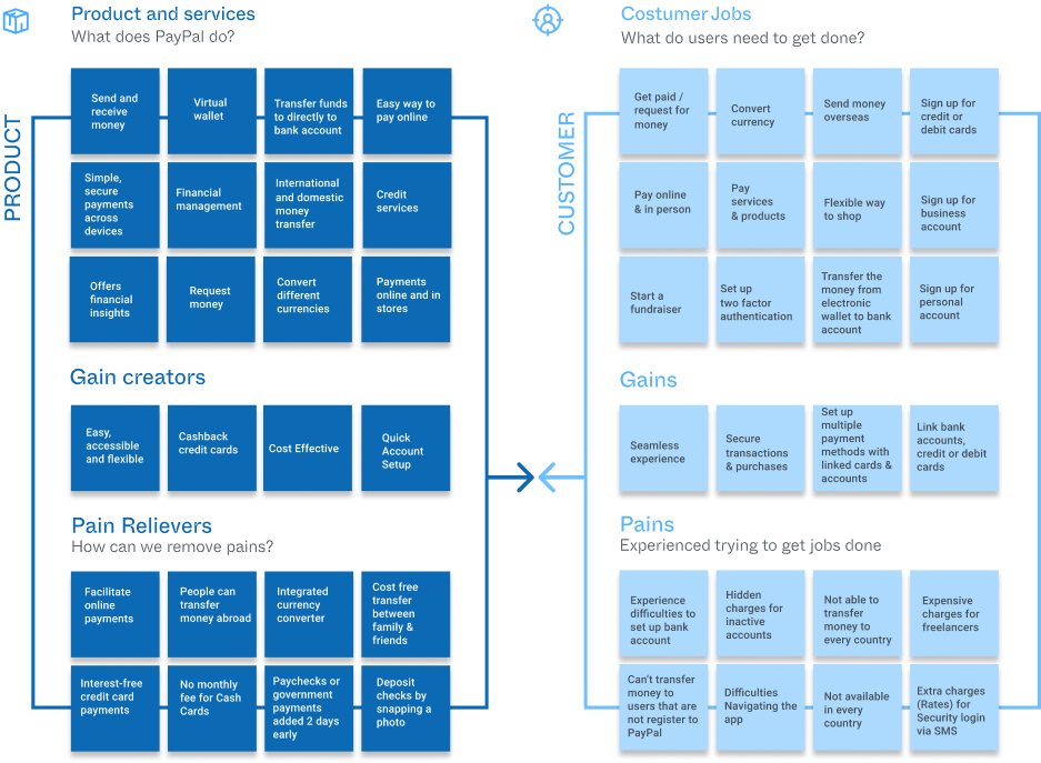
PayPal is a multinational financial company created in 1998. It facilitates online payments and supports online money transfers. It has helped small businesses grow faster by creating a safer, more convenient, and trustworthy way to pay, send or receive money online. It facilities customers' experiences by providing a service that allows them to pay in any way they prefer without sharing any financial information.
Project's Goal: I wanted to create a feature to facilitate group expense organization and participants' transactions.
Why create a new feature?
Today's FinTech is adapting its banking services to provide a more accessible, secure, adaptable, and memorable experience for customers to use on the go. Even though PayPal is one of the most used financial services globally, they don't provide a service for group billing. I believe that today's lifestyles and finances tend to be more collaborative and cost-sharing. This is why I think PayPal has an excellent opportunity to provide a memorable user experience and facilitate an easy cost-sharing calculation with a smooth transaction interaction.
Goals and Objectives.
-Understand the current market
-Identifying the user
-Understand user's expectations
-Identify user's needs and habits
-How to facilitate transactions between PayPal users and non-users.
What I did
I used the double diamond strategy to help me explore and understand situations where the users encounter problems, frustrations, and peer pressure when sharing their bills. I brainstormed business and design ideas to create solutions by gathering insightful data.

Double Diamond Strategy
Project Duration - Timeline
80 hours
D I S C O V E R
The Process
To start this project, I created a SWOT analysis to understand Paypal's business core and its current market value. Then, I created a survey that helped me find key participants from different financial backgrounds and ethnicities. I conducted the interviews online, through zoom. I asked the participants if I could record the call, to which they agreed.

I learned a lot about their behavior and the pain points they faced when they split the bill in a restaurant and after a long group vacation. After that, I created transcripts and organize the data using different design thinking methods. I analyzed, empathized, and identified opportunities for Paypal to explore. For example, one of the methods I used was the empathy map. This tool helped me better understand the users' needs and have a more compassionate decision-making.

Empathy Map
Here are some interesting insights:
- People feel socially pressured to split bills into equal parts to avoid complicated calculations.
- They associated PayPal only with online shopping.
Another exciting design thinking tool I used was the Value proposition. I used this tool to visualize & ensure that PayPal services and app design can satisfy their users' needs. Then I created a persona that represented the type of user that would be using the new feature.
Value Proposition
Finally, I thought it would be helpful to create a competitive analysis to identify unique features from PayPal and its competitors by comparing one another. I then created a persona that represented the type of users that uses Paypal. I soon realised that creating a persona helped me have a better picture and represent user's needs, behaviors, goals & expectations.

The Problem
User's Pain Points
Confusing Group Bill:
Keeping up with group expenses can be challenging.
"During the trip, people are constantly paying for things. It's hard to keep track."
Convenience:
People want to have an easier way to pay others.
"It's so annoying to register people's bank accounts."
Peer pressure:
Paying extra to avoid annoying the group
"I can see how annoying it is for people when I ask to pay for what I ordered."

D E F I N E
Ideation
One significant insight is that PayPal already offers a feature to split their bill. However, it is not as visible, and people do not know where to find it. I decided to perform a card sorting exercise to understand the user's navigation expectation.

People expect both Join and create PayGroup to be accessible directly from the Pay tab.
My next step was to develop a site map and experience model based on the card sorting framework results. I grouped and organized features more intuitively to deliver a more memorable experience. After that, I created an experience map to visualize how the new feature would operate, how it would be accessible by users, and how the user would interact with it.

Click here and discover more design tools and the rest of my research !
D E V E L O P
Prototype
In my first design attempt, I wanted to respect the current design style Paypal has. I created icons that mimicked line quality and color. And also recreated icons that are currently in use.
Main Menu
Users will have the main menu at the bottom of the screen to scan/pay, scan, request and access more features. Paypal's main menu is currently displayed that way. However, I added quick access to PayGroup inside of every page.


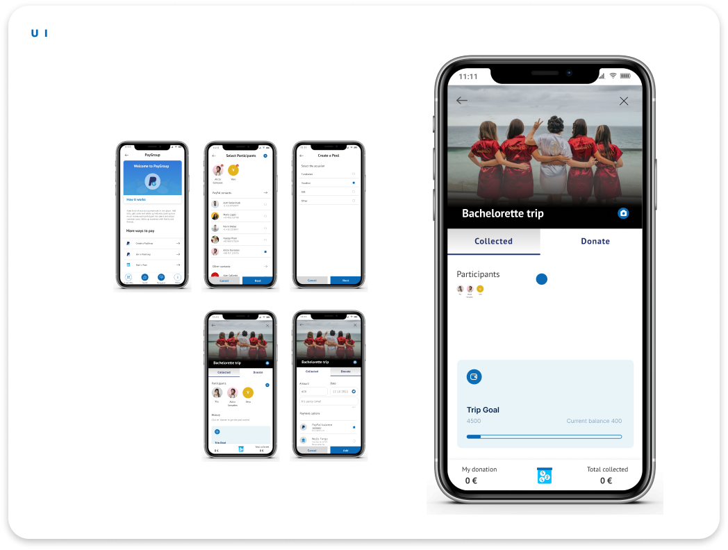
There are two ways to use PayGroup. There is a fundraiser option or shared pool where every participant adds an equal amount and spends the collected amount throughout their journey. Or, there is the Group Expense tracker where users can track how much people have paid who needs to pay and get paid.
Functionality
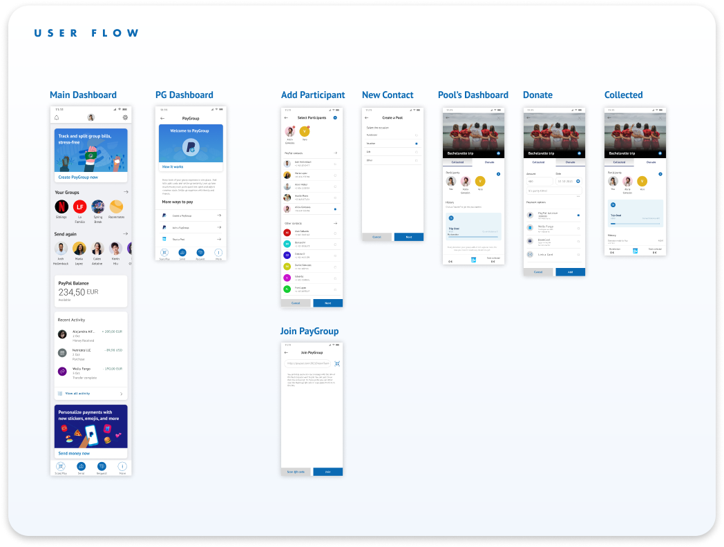
Once you have clicked on PayGroup, people will add participants directly from their contact list. Users will have to allow the app to access this information after they download the app or directly on the settings page. After adding participants to their PayGroup, they will define the category for the group. Users will always be able to customize the group after creating it.
So how does it work?
Inside the group, users will have two tabs. One will display their current balance, and the other will allow participants to add an expense. At the bottom of the screen, users will see their current balance (what they have paid) and the total group expense. To add an expense, participants will be able to share a photo of their receipt, add the amount, give a description and add the date of the transaction. Users will also tag or add only the people with whom this transaction will be shared.


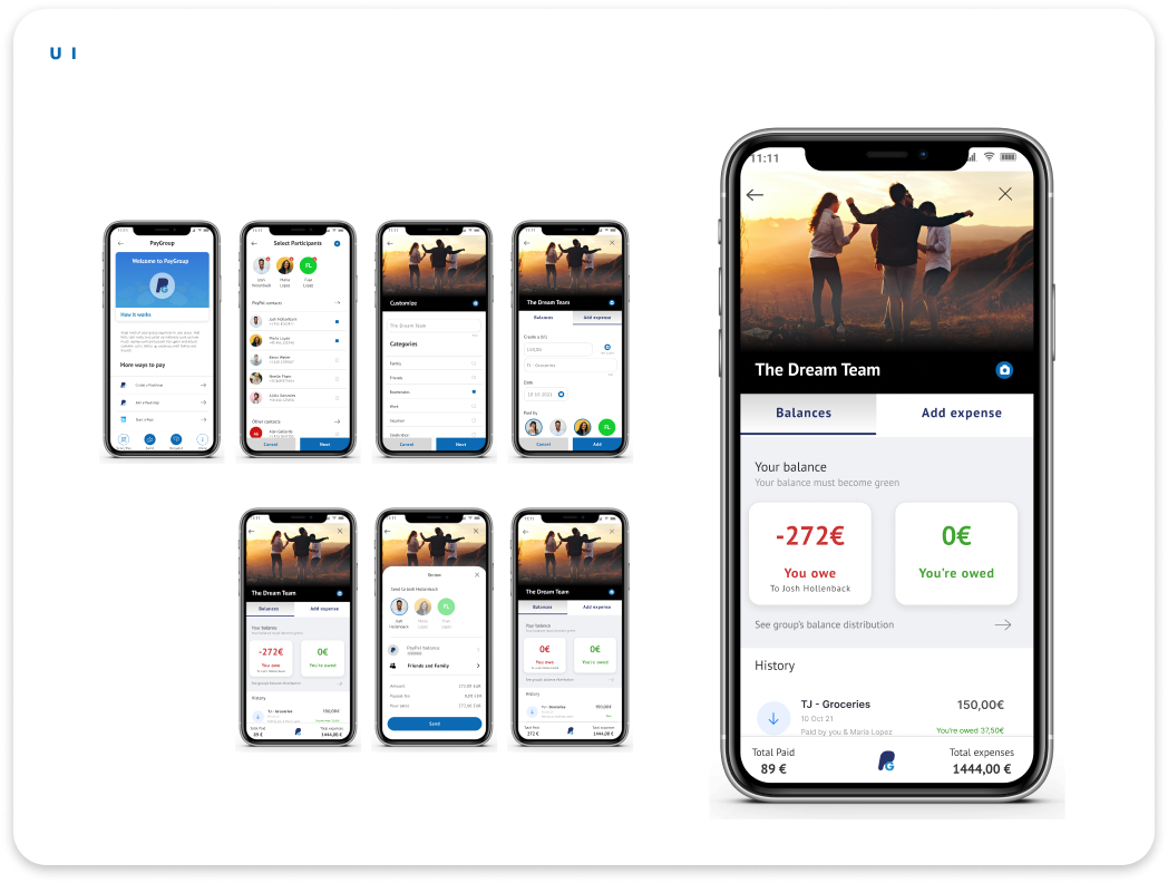
Fundraiser or Shared Money Pool
Finally, there is the money pool where participants can add money to a shared "money pool" and use the amount collected. People can donate as much as they want and pay anywhere thanks to a shared QR-code, online debit card, or physical card.

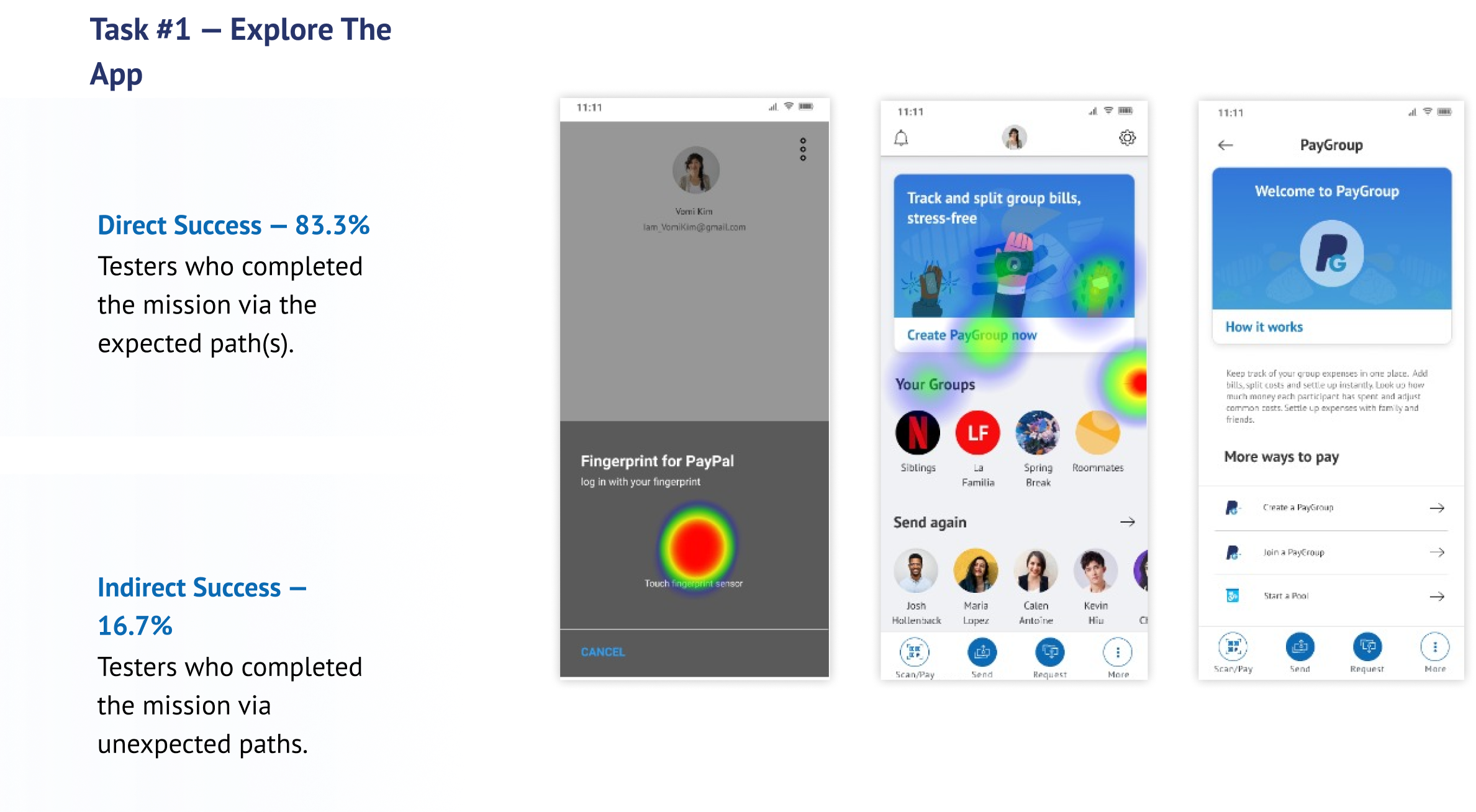
USER TESTINGS
& interactions

\
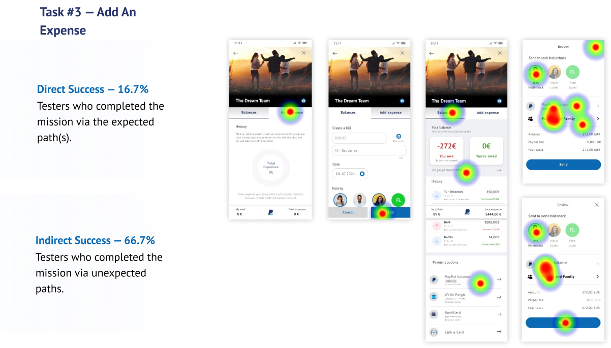
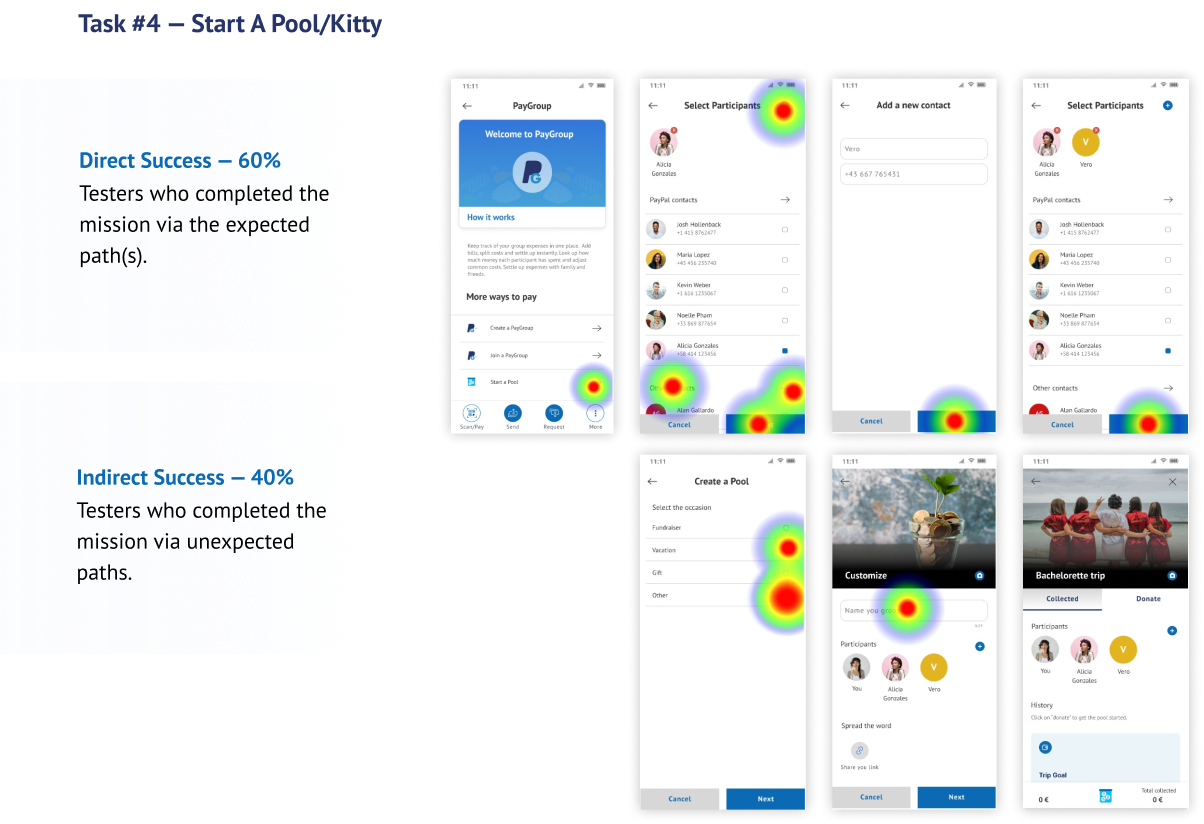

Results
Affinity Map
After user testings, I created an affinity map to display essential insights and users' overall experience navigating PayGroup. I organized observation, unexpected situations, suggestions, pain points, revisions, and iterations.
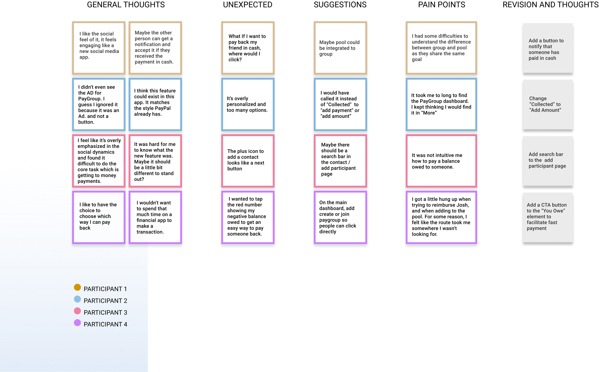
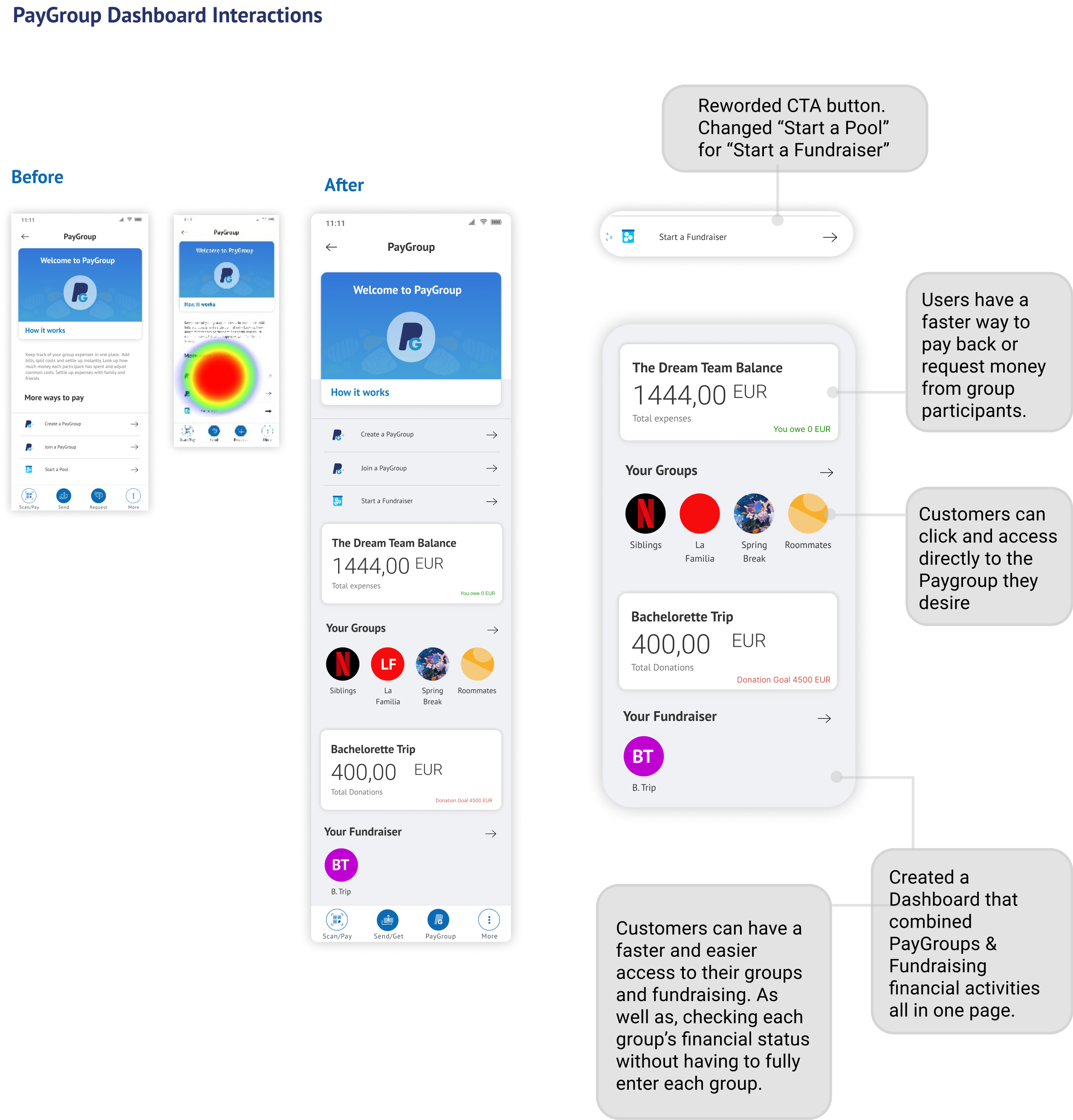
Iterations
The following design changes come from insights collected during user testings and interviews. Thanks to the affinity map, I was able to prioritize the top three elements affecting the usability.


D E L I V E R
Final product
We must consider that some users are not interested in paying electronically but in cash. Part of future iterations would be business and behavior-focused to reverse customer habits and dependency.


D E L I V E R
Prototype
Final Thought
What I learned
While developing this case study, I noticed how restrictive and controlled the fintech world is. There are so many regulations applied to different countries, which would affect how people would interact with the PayGroup feature.
This project taught me the importance of delivering the perfect product to create the perfect "user delight" type of interaction. Because of security reasons, there will always be steps that users will find boring or annoying to do. However, by creating a cheerful emotional design, PayPal could influence their customers' behavior and opinions while interacting with the new PayGroup feature.
The Future
What's next?
Because I only had 80 hours to develop this project, I could not continue my research. Even though there are applications fully designed to help users organize their expenses, their functionality is not 100% clear to their customers. The next step would be more research and more user testings with a larger group of participants. It is essential to check every country's regulations, where PayPal is mainly used to adapt the PayGroup feature's interactions and functionalities. I noticed elements and interaction paths that could improve, creating a sleeker and intuitive experience for users.